I’d like to start by asking you about Art Tower Mito.
I was in charge of that project, back before I opened my own firm when I was still working for Isozaki Arata. That was completed in 1990, after which I went independent. I worked for Isozaki for seven years, and three and a half of those were spent on the Mito project.
The tower itself really has the look of something from EXPO 70.
Well, it was Isozaki’s design, and I was just in charge of carrying it out. The tower is a complex shape, but another interesting thing about this space is that it’s composed of three facilities – a contemporary art gallery, a concert hall, and a theater. Normally there would be some kind of lobby interconnecting these spaces, but not in this case. Its just a chain of rooms in a row. Common sense says that this is going to be a problem, and I was nervous about it, but Isozaki said that it would be fine. It turned out to be great. When you build with the goal of completeness, with all the accoutrements for each room, you end up with something easy to use, but nothing very interesting tends to happen in those spaces. But if you think of urban streets, and the little theatres and spaces along them, they don’t have room for a lobby, you just enter and immediately things are happening. If there’s a break, you go outside, back into the streets. So you’re not as severed from daily life, it’s more interconnected. The type of design I’m doing now is completely different, but I learned a lot on this project about creating a desired mood.
So the exterior served as the lobby in this case.
That’s right. We worried about the concert hall and theatre using the same space, but the ticket collectors just stand at the doorway, and it works out fine. Theatre used to happen outside in the open, but over time it becomes established and moves into buildings. And looking at the history of architecture, most buildings are made of two types of spaces, the rooms with some specific purpose and the spaces that chain those rooms together-“spaces to be linked” and “linking spaces”. That privileges the rooms with purpose and the hallways and linking spaces lose importance. So what I started thinking is that using linking spaces exclusively could be interesting. That was when I started my own firm, in 1991. I didn’t really know what I wanted to build at that time, but I ended up designing a bridge.
The Mamihara Bridge (1995)?
Yes. That was my first independent project, down in Kumamoto. When you think of designing a bridge, you could put a balcony or a terrace on it, but I wanted to do something different. First of all, it’s still a road, or at least a piece of a road. So the road wanders along until it reaches a river, then mutates briefly before returning to normal on the other side. It’s as though the road is sick for a moment, then healthy again. But it must still function as a road. So I started wondering what kind of sickness would be interesting, and decided on having the road split into upper and lower sections then fuse again on the other side, so some people could take the upper path and others the lower. Once designed, that turned out to be cars above and pedestrians below. One way of looking at this lower section is as an inversion of the traditional Japanese arched bridge. But it has the advantage of creating a covered space, shaded in the summer that still allows the breeze to flow through, with the river just below. So now locals have parties there all the time. There are no benches or places to sit, so people bring their own chairs, then sit around and drink with their friends. Even at the opening ceremony, when the locals had already started using the bridge, one guy came up to me and said, “it’s a nice bridge, but there’s just one problem: it needs an electrical outlet.” He wanted to plug in a karaoke machine! I really think I’m the only architect who has ever been chastised for forgetting to put outlets on a bridge!
You mentioned the traditional arched bridge, which was often appreciated for the inverted arch reflected in the water below. With the Mamihara Bridge it seems as though you’ve materialized that reflection, raising it up to join the upper portion.
That’s true. This issue of the material and the non-material is something that I would take up later with the Louis Vuitton projects. People just get bored with things after a while. Especially in the commercial realm, holding people’s interest for five years is about all you can expect. But for me, I’m shooting for something that will be still be interesting five years later, hopefully longer than that. Architects probably have to think this way. So with the Louis Vuitton projects I was trying to think of a way to keep those interesting for more than five years, and came up with a strategy of building something that wouldn’t be seen as a material object, building a non-material thing, or building something materially that feels, at least, like it is non-material. I felt that if this could be accomplished then people wouldn’t get bored with it, since it’s not a “thing”. So the focus was on the non-material aspects of this project.
The first was Louis Vuitton Nagoya (1999), right?
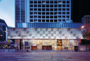
Yes. The first layer is glass, and then 1.2 meters back is the wall. There is a checkerboard pattern on both the glass and the wall behind, and the combination produces a Moiré effect. It moves around. So this is not a pattern that exists there in reality, it’s an illusion, a phenomenon. As you get closer, the pattern itself becomes smaller, and grows as you step back. And if you move sideways, it moves with you.
It chases you?
It does. It’s strange, what’s there is real glass and real walls, what people tend to see is not that reality but the pattern that doesn’t actually exist. It’s been ten years since we built it, but it still has an impact.
How did you come up with this idea?
It’s just from everyday experiences. For example, in Japan, women would traditionally wear gossamer kimono in the summer, and since they were so fine it was typical to wear two layers. That creates this sort of Moiré effect, it’s really beautiful. And if you look carefully as you walk around the streets a number of things will overlap and create this sort of pattern. Or if you use a screentone to add texture to a drawing, and it seems to need a bit more, so you add a second layer, again you’ll produce a Moiré pattern. So it shows up in everyday life, but I found it beautiful and decided to use it for the project.
You’ve done a number of the Louis Vuitton shops now, how do you put together new ideas for each project?
Louis Vuitton started out making trunks, so there is an association with travel. Most brands would probably want an architect to design each store with the same identity, but Louis Vuitton asked me to design with the history of each city in mind. They didn’t want them all to be the same. So in each case we had to think from scratch about what would that city’s version of Louis Vuitton should be. The New York Louis Vuitton (2004), for example, at the corner of 57th and 5th Avenue, a corner where the buildings are from the 1930s. They have these characteristic setbacks near the top. At that time, Hugh Ferriss, who did perspective drawings of buildings – he was just an artist, so the architect would draft the plans but then have him do a drawing that would be presented to the client – he was extremely talented. So much so that even if the architect was fairly bad he could correct enough with his drawings, and he would make suggestions to the architects as well. He would draw the skyscrapers with images of steep mountains or crystals in mind. New laws at the time forced architects to constrain the width of the buildings as they got taller, so it may have been natural for him to think of crystals. There are a lot of buildings with this shape, including mine. But you usually can’t see the crystal, that ice. So with my design, I tried to make an overt gesture to Ferriss’s ice crystals with the glass on the front there. And with ice, there are always some sections that are more translucent than others, so we simulated that effect with gradations in the cloudiness of the glass.
It looks like an inverted icicle.
The idea is that you’d see this one section and begin conceiving of the entire building as made of ice. Then again with the White Chapel project (2006), we tried to give the feel that you’re not in a real “thing”, but rather in something that isn’t actually there, some kind of mass of air. And air itself is actually comprised of little bits of air on the molecular level, so it’s full of holes. I thought it would be interesting to see if we could make a building in that same style. So we used these metal rings, brazed together, as the structure here. They’re not just decoration in this case.
This lattice of rings is a load-bearing wall?
That’s right. They’re rolled steel. So it was in some ways an extension of the Louis Vuitton projects.
To return to this idea of inflecting your projects with local culture and materials, how did your Omotesando project for Louis Vuitton engage with the 1920s Döjunkai apartments then still across the street?
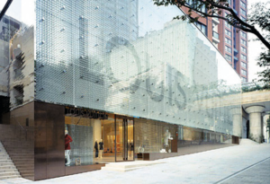
When I designed the Omotesando building I didn’t know the Döjunkai apartments were going to be torn down. I really loved them. They’re important historically, of course, but they were built at a time when everything was smaller. I suppose the Japanese were shorter then, but the ceilings are low, everything is on a different scale. Even when you put all the rooms, or apartments together, that combination is still tiny. And they’re all living spaces in a row, so there’s a lot of repetition: roof-roof-roof, stairs-stairs-stairs, window-window-window. So it’s small, there’s this repeating, and all of it is encapsulated within the trees. And I wanted the Omotesando Louis Vuitton building to be able to fit in with the Döjunkai apartments. We used glass on the project, but instead of the kind you’d use in Ginza or New York, we added a delicate texture to it like that of the leaves of a tree. That with a reed-blind made of metal. And instead of a single solid building looking as big as it could, we decided to give it the look of a combination of small parts. And so if Louis Vuitton is a trunk and suitcase company, then the building itself could look like a pile of luggage, a stack of blocks.
It almost looks like the row of Döjunkai apartments turned on end.
We did want it to mesh well with them. Then they torn them down!
Now it’s going to be seen as homage.
With an area like Omotesando, that’s got something to it that appeals enough to people that they gather here, I wanted to capture and emphasize elements of the area that have that allure, but which might not be conspicuous. And if a number of builders do the same, we might be able to maintain the appeal of these districts even if things are getting torn down and replaced.


